Friday, December 2, 2011

Review Week 16


How many points are in an inch? How many points are in a pica? 72 points in an inch. 12 points in a pica.

Of the seven classifications, which classification(s) would best work as body type? Why? Number 2.  The body typeface must be  the same the whole time and use a small, easy to read font.

Identify the lowercase characters that have ascenders? h, t, b, d, l, f

Identify the lowercase characters that have descenders? p, q, y, g, j  


Classify the following typefaces and briefly explain why you believe it should be classified that way:
01.png
1.  I would characterize this font as Script.
This font is reminiscent of handwriting.


06.png
2. I would characterize this font as Old Style.
It was wedged-shaple angle serifs and a low
contrast of thick/thin strokes. 


02.png
3.  I would characterize this font as modern. It was sharp contrast
between thick and thin strokes and has flat serifs. 
04.png
4. I would characterize this font as Sans Serif.
It has no serifs and the stroke are uniform in weight
and have a monotone appearance 
05.png
5. I would characterize this font as decorative . This font has
fun block letters and shading. 
07.png
6. This font would be characterized as Blackletter. Is resembles calligraphy
It i highly ornamented and has thick and thin strokes. 

Tuesday, November 29, 2011

Stephen Kroninger

What kind of art/design does he produce? Photo-collages and children's books.

In what publications/media studios has his work been featured? Time Magazine, children's books, Newsweek, The New Yorker, The New York Times


Post 2 samples of his art. Answer the following questions for each piece...


Was this piece published? Where?

1. New York Times 2. Time Magazine Health
What principles of design were utilized within the piece? How?
1. Proportion, the heads are big and the bicycle is small. 2. Balance and variety, the picture images but together balance each other even though they are so different.
What elements of design were utilized?

1. Space and texture. 2. Texture and shape. 


1.    
2. 

Review Week 12

How can you, as the designer, use principles of design to help compose a page?
Using the principles of design, you can better your page. The principles of design will help you perfect your page and follow certain guidelines to make sure your page turns out the way you want.
What are the principles of design (define each in your own words)?'


  • Balance: equal weight in the image

  • Proportion: relationship between objects as a whole

  • Rhythm: how images are repeated as a whole

  • Emphasis: attention to details 

  • Unity: visual linking of elements

  • Podcast #4 Typography


    Define typography? The art of expressing ideas through the selection of certain typefaces.

    Where did the word "typography" originate from? Greece

    What does typography involve? Creating and modifying type using a variety of illustration tools.

    What is a typeface? Distinctive designs of visual symbols that are used to compose a printed image/design.

    What is another term for typeface? Fonts.

    What is a character? Individual symbols that make up a typeface. Letters, numerals and punctuation marks.

    What is type style? Modifications in typeface that create design variety while maintaining visual style of the typeface.

    What does type style "create" within a design? Bold, italic, condensed, roman, heavy.

    What is the waist line and what does it indicate? Imaginary line drawn at the middle of the characters.

    What is a base line and what does it indicate?  Imaginary line drawn at the bottom of characters.   

    What is an ascender? The part of the characters that extends above the waist line.

    What is a descender? The part of the character that extends below the base line.

    Describe a serif? Smaller line used to finish off a main stoke of a letter, usually at the top and bottom of a character.

    How can the size of the typeface be identified? Measures from the top of the ascender to the bottom of the  descender.

    What is a point? THe vertical measurement used to identify the size of the typeface.

    How many points are in an inch? 72

    What is a pica and how many are in an inch?  A unit of type size and line length; 6

    How many points are in a pica? 12

    What is body type and where can it be found? Type sizes that range from  4 pt through 12 pt type.

    What is the key to selecting appropriate typefaces to be used as body type? 

    What is display type and how is it used? Type sized above 12 pt. Used to draw attention to a message.

    What is reverse type and when would it be used? Consist of white type on solid black or darker color background. If text is too small reverse type can be too difficult on the reader's eyes.

    What is a typeface classification? A basic system for classifying typefaces was devised in the 19th century when printers sought to identify a heritage for their own craft.

    When was Blackletter invented and how was it used? Blackletter was the earliest typeface, used with the invention of the printing press in the mid 1400's.

    Describer the characteristics of a Blackletter typeface? Blackletter typefaces resembled the calligraphy of the time and are highly ornamental with elaborate thick to thin strokes.

    When was Old Style invneted and what was is based on? Based on ancient Roman inscriptions and created to replace Blackletter typefaces.

    Describe the characteristics of an Old Style typeface? Wedge-shaped angle serifs and a low contrast of their thick/thin strokes.

    When were formal scripts developed? 17th and 18th century.

    When were casual scripts developed? 20th century.

    Describe the characteristics of a Script typeface? Should not be used as small body text. Varied strokes reminiscent of handwriting.

    When was Modern typefaces developed and why? Late 18th and 19th centuries. As a break from the traditional typography of the time.

    Describe the characteristics of a Modern typeface? Sharp contrast between thick and thin strokes and have thin, flat serifs.

    How early can Sans Serif typefaces be found? What happened? As early as the 5th century. The Italian  Renaissance returned to Old Style and made the Sans Serif obsolete in the 20th century.

    When did they become popular? In the 1920's.

    What does "sans serif" mean? "Without Serifs."

    Describe the characteristics of a Sans Serif typeface? Strokes are uniform in weight and have a monotone appearance.

    When was Slab Serif developed and why? In the 19th century for advertising purposes. Mainly used for decorative purposes and advertising.

    Describe the characteristics of a Slab Serif typeface? Uniform line weight and thicker, square serifs.

    Describe Decorative typefaces? Uses a variety of typefaces that don't belong to other classifications, may incorporate pictures.

    Why were they developed? Developed with a specific purpose or theme in mind.

    What are they best used for? Larger point size or display type. 

    Monday, October 31, 2011

    Andy Warhol

    Within what art genre did Warhol work?
    Pop Art.
    Define the genre?

    Art based on modern popular culture and the mass media.
    During what years was he alive?
    1928-1987
    Post 2 samples of his art. Answer the following questions for each piece.
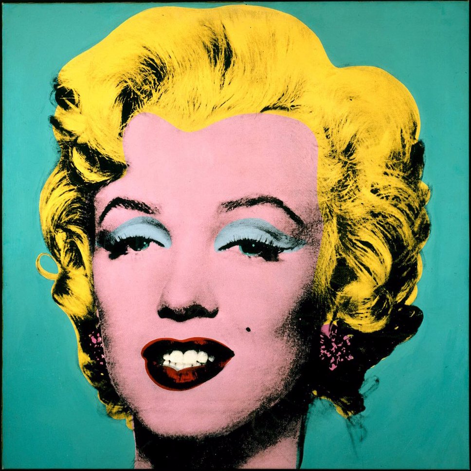
    Marilyn Monroe


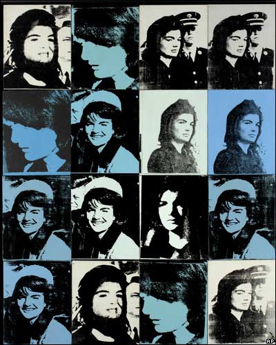
    Jackie Kennedy 


    Describe the color that he utilizes. Does he use any particular color scheme?
    He uses the same colors through out the Jackie pop art, they are monochromatic. Marilyn uses yellow, blue, and red. That is triadic.
    What do you notice about the artwork itself?
    It stands out, you can only see their faces.

    Friday, October 21, 2011

    01.jpg
    Complementary
    02.jpg
    Analogous
    03.jpg
    Monochromatic
    04.jpg
    Split Complementary
    05.gif
    Triadic

    Review Week 9

    Compare and contrast vector graphics and pixel images.
    Pixel images are based off the construction of pixels and depend on resolution. Vector graphics are made of a mathematical equation and are not dependent of resolution, constructed by lines, shapes and curves.
    What resolution is necessary to print raster images?
    Usually 300 pixels.
    What resolution is necessary to display raster images on the internet?

    72 pixels

    Friday, October 7, 2011

    Review Week 8

    Why must designers pay close attention to how color is utilized within a composition?
    Color can make a piece or ruin it. For me, it's color that draws me to a design. Different colors also mean different things or make you feel a certain way, so you want to have the right color.

    Why is the color wheel an important tool for graphic designers?
    The color wheel is a tool that all artists have used to match colors and also goes along with the color theory which is important for artists.

    Find an example of neutral colors utilized within a design (hint: google poster design). Near the sample, discuss why you feel the designer included neutral colors within the composition. 

    There aren't many neutral colors on the poster besides the background. I think the designer made the background neutral so everything else will stand out and catch you eye. 

    Briefly describe how we "see" the color of an object?
    Colors are either absorbed or reflected. We see the colors reflected by light. 

    Podcast #2 Color Theory

    The right use of color can do what?
    maximize productivity, minimize visual fatigue, and relax the body
    Within the electromagnetic spectrum, which waves allow us to see color?
    visible light
    Describe white light?
    it is equal parts of all colors in visible light spectrum
    How do we see color if objects "have no color of their own"?
    Light hits an object, the color reflects back to our eyes and that's what we see. All the other colors are absorbed.
    What is a glass prism?
    a transparent triangular object that breaks white light into all colors
    What seven colors result when white light is refracted through a prism?
    red, orange yellow, green, blue, indigo, and violet
    Describe hue?
    The actual color we see.
    When does white light occur?
    When all the the wavelengths reflect back your eye
    When does black light occur?
    when no light is reflected back to your eye
    How color is perceived depends on what?
    the type of light it is seen with
    What is a color wheel?
    a visual tool that shoes the relationship between primary, secondary, and tertiary colors

    What are primary colors? Name them?
    Red, yellow and Blue. 3 basic colors that can be mixed to make other colors.
    What are secondary colors? Name them?
    Orange, green, violet. Result form mixing primary colors.
    What are tertiary colors? Name them?
    Red-orange, yellow-orange, yellow-green, blue-green, blue violet, and red violet. Result of one primary and one secondary mixed together.
    What are neutral colors? How can they be created?
    Black, grays, whites and browns. They can be created by mixing complementary colors which neutralize them.
    How can a neutral color help a design?
    Can help promote and emphasize other colors.
    What are complementary colors? Name them?
    colors positioned opposite of each other on the color wheel
    What is color value?
    lightness or darkness of a hue or color
    What is a shade?
    adding black to color producing a low-value color
    What is a tint?
    adding white to a color to produce a high-value color
    What is saturation/intensity?
    a brightness of color
    What happens when you mix complementary colors together?
    you create a dull tone
    Describe color harmony?
    a pleasing arrangement of parts. ex. music, poetry, color.
    What is a color scheme?
    harmonious color combinations used to create style and appeal
    Describe a monochromatic color scheme?
    uses tints and shades of one color, clean and elegant, easy to the eye
    Describe an analogous color scheme?
    uses 3 colors adjacent to each other on the color wheel

    Describe a complementary color scheme?
    uses 2 colors opposite of each other on the color wheel
    Describe a split-complementary color scheme?
    uses 3 colors, 1 color, 2 adjacent to its complementary
    Describe a triadic color scheme?
    uses 3 evenly spaced around the color wheel
    What colors are considered to be warm colors?
    yellow, orange red
    Describe a warm color scheme?
    expresses aggression, excitement, and danger.
    What colors are considered to be cool colors?
    greens, blues, violets
    Describe a cool color scheme?
    soothing i nature, gives impression of calm
    Why is important to consider which colors are being used within a design?
    thik about how the colors are percieved

    Friday, September 23, 2011

    Review Week 6

    What is the pen tool used for? The pen tool places anchors on a path that creates an object eventually. You can use the pen tool when tracing or just drawing an object.
    How can you manipulate a path/line in Illustrator? Discuss the use of the white arrow tool, pen+, pen-, and convert too. If you need to manipulate a line that you have drawn with the pin tool you and use the pen+ or the pen- tool. The pen+ allows you to create extra anchors on a line, which, in turn lets you manipulate the line to curve more, be straighter, become longer, etc. The pen- tool allows you to delete anchors on a line. You can use this tool to shorten a line or move a line a certain way. In order to add or delete anchors though, you must use the white arrow tool. When manipulating a line after adding or deleting anchors you also have to use the white arrow too. The conversion tool allows you to convert a corner point into a curved point.

    How can you utilize the layers palette in Illustrator? You can use layers when tracing an object. Whatever you're tracing from can be locked on the layers palette so it doesn't move while you are tracing on it.

    How do you create a clipping mask in Adobe Illustrator? To create a clipping mask you first draw a square around the object. Then you select the object and bring it to the front so it is on top of what you're tracing. Then you go to make clipping mask.

    Review Week 5

    Value: This design represents value of black and white. The lungs made from tree branches stand out because of the white background. They made it this way because the contrast from white and black makes the opposite stand out even more. 
    Space: This design has and abstract and organic feel to it.  All of the lines flow right into the next.  Several shapes make us this design and they give a sense of calmness. 
    Shape: This poster has very angular shape. It creates a harsh and serious feeling.   The  shapes used are triangles, rectangles, squares and a few circles. The shapes are used in the geisha's outfit mainly.

    Line: This poster has curvy, smooth lines.  They make you feel calm and have a fun feel to them.  In a way, it look very retro and might remind you of the 60's.

    Texture: This movie poster has lots of texture.  The title of the movie looks handwritten, the background looks like a wall inside of a house. Even the fork looks like a real fork. This poster gives off a dark feeling.


    Thursday, September 15, 2011

    Review Week 4

    Why/how can icons be used to communicate? Icons are used to communicate a message without having to use text. Everyone can understand the icon despite language barriers. 

    Via the internet, find 2 examples of common icons that clearly communicate their message. Post both in this entry. 


    What is the difference between copyright and public domain? Copyright is when there is a legal stamp on the item stating that you can't copy it without permission/ Public domain means that everyone is available to access and use it.

    How can you avoid plagairism in this class? In other classes? You can avoid plagairism by doing your own work and using your own original thoughts not matter what you're doing.